

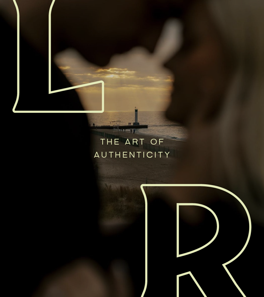
LR Studios
A full-service photography company specializing in authenticity and creativity
project scope
Brand identity
Print material design
Merch design
*This project was a dream collaboration with my dear friend Sarah Walker Designs.
Photography: LR Studios


Behind the brand
LR Studios is a full-service photography brand that captures life’s most authentic moments through both photo and video. Lydia’s approachable and supportive style helps clients feel at ease, whether she’s capturing weddings, documenting family milestones, or helping business owners with professional branding images.
In 2024, a rare opportunity to take over and revamp a local photography studio presented itself to Lydia. She saw this as a way to connect with other local photographers, generate passive income, and meet a real need in the London market, and couldn’t pass it up. While her DIY brand had served her well up until then, expanding into a new area with a different audience made it clear that it was time for a more cohesive, strategic brand to reflect her growth and serve her well as she continued to expand.


deeper meaning
Lydia’s original DIY logo featured a moon and star motif, but she was tired of the look and was ready for a change. As Sarah and I reflected on Lydia’s personality and brand direction, we realized the celestial theme had so much untapped potential for connection and deeper meaning. The stars represent the storytelling at the heart of Lydia’s work, while the constellation mirrors the journey from a first photoshoot to the many milestones in people’s lives. The moon phases symbolize the transitions she captures, and the shooting star reflects the fleeting moments worth preserving.
In reimagining this theme, Lydia realized she wasn’t tired of it at all—she was just yearning for a deeper connection to it. By expanding upon this familiar concept, we created a refreshed brand identity that honours Lydia’s roots while giving her a unique and memorable presence that bridges the past with the exciting next chapter of her growing business.


Visual storytelling
Lydia knew she didn’t want her brand to blend in with the rest. To stay true to both her personality and the essence of her business, we leaned into bold, expressive typography and a fresh, memorable colour palette that conveys her values and appeals to her audience.
The sturdy, angular typography mirrors Lydia’s grounded yet creative personality, with upward angles evoking stargazing and looking to the future milestones of life. We incorporated subtle astrological motifs in the submarks, ensuring they remained unique and memorable without feeling cliché.
The colour palette radiates warmth and originality, setting LR Studios apart from her competitors who often rely on black and white. It unifies the diverse branches of Lydia’s business while creating a welcoming, approachable feel, ensuring clients from all walks of life feel at home.
By carefully balancing the celestial theme’s subtlety and depth, we created a dynamic, unforgettable brand that truly reflects Lydia and will serve her well as her business continues to grow.


